Additional insights from web3 reward emission research

We are currently undertaking a large-scale research effort to create better frameworks for token mechanics especially for web3 protocols in the hardware resource provisioning sector.

We have recently published part one, where we have compared emission schedules of various web3 networks, including of course Pocket network. You can find the report here.

We wanted to share some additional data with the Pocket community though, that is not in the report.

First off, we have classified Pocket’s token rewards to be in the category of KPI-driven and constant emissions. For that category the token rewards are tied to a KPI, which is the RelaysToToken-Multiplier in our case and they follow a constant amount or rate (not decaying to 0) as long as the underlying KPI is constant.

Within that category there are currently also the following projects we analyzed:

  • Livepeer
  • Nucypher
  • Covalent
  • Hopr

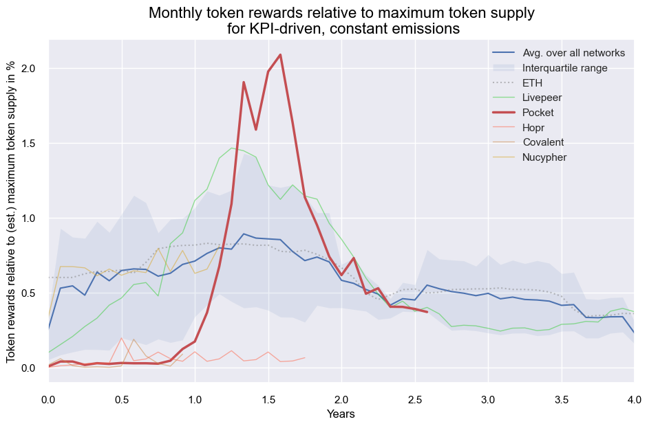
In comparison to the other projects in this category, Pocket saw the typical steep increase of emitted rewards when the network scales up. Despite having the steepest increase in monthly rewards relative to token supply after ~1 year, the cumulative sum of those rewards is still below 20% today, which is less than e.g. Livepeer at that stage and also at the lower end of the spectrum compared to all the web3 infrastructure networks we analyzed.

Below chart shows the average (blue line) and the interquartile range (blue shaded) of the monthly token rewards of all Web3 infrastructure networks together with the projects of the KPI-driven and constant emissions category highlighted:

Next we looked into the dollar value of those emissions, to compare how nodes are actually getting compensated:

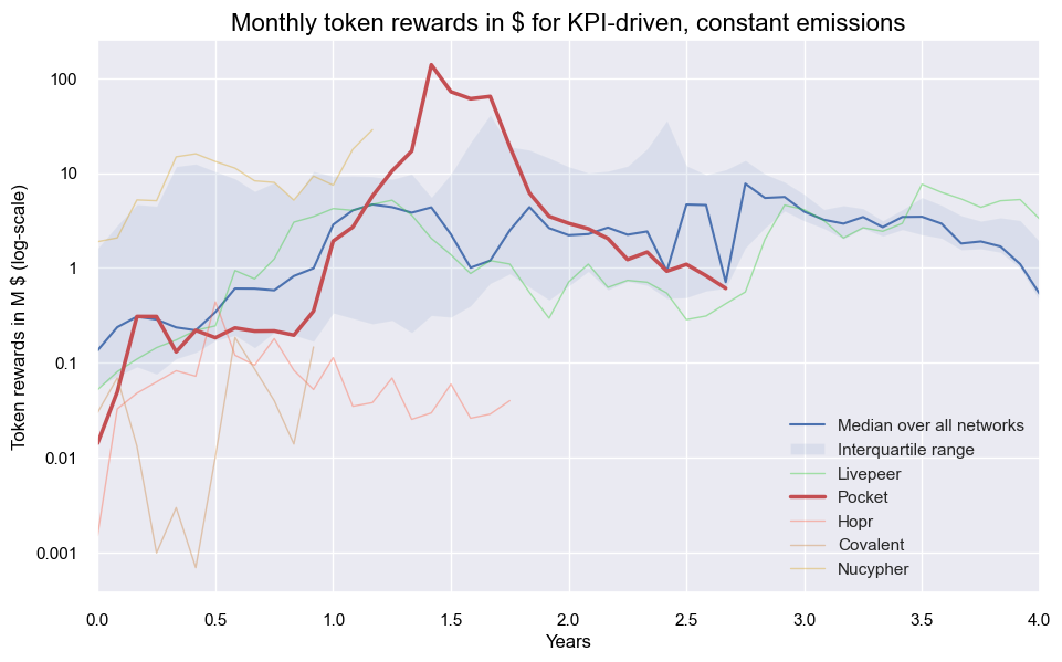
Pockets reward emissions in dollar-terms are most elevated in the time of early 2022 in line with the POKT price and declined afterwards when market conditions no longer provided tailwinds. Despite the high peak of POKT emissions, the KPI driven schedule reduced the emissions eventually to the point where we are now, much further in line with other protocols.

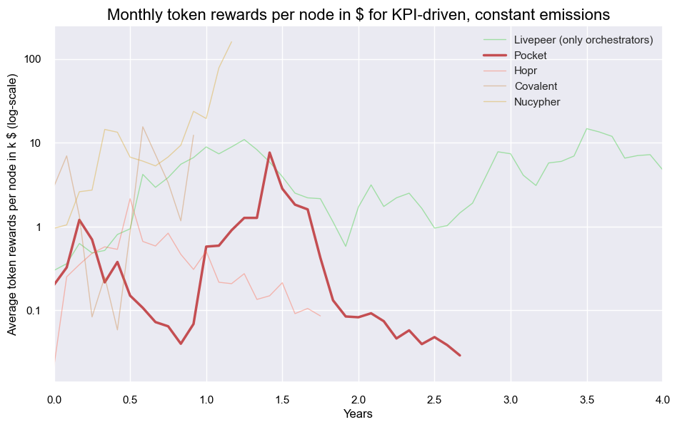
More information is available in this repo that also contains the paper with further details on the published report and caveats. One example of those: below chart with rewards per-node needs to exclude rewards for delegators for a somewhat fair compariso, which we couldn’t get for Nucypher and Covalent (yet).

Those (avg.) rewards in dollar-terms per node decreased in line with the total rewards in dollar-terms below 100$ over the past six month (given node count stayed above 20k since the start of 2022):

We hope this information yields some insightful information for the pocket community and are open to your feedback. What would be some additional data you would want to see?

7 Likes

Thanks @robko

I got a 404 when trying to access the repo. Can you please make it public or add my email for access (sent you a DM)?

Re the last diagram, are the numbers for Pocket skewed given the very high number of nodes in Pocket compared to other networks? Eg 20,579 nodes in Pocket v 100 orchestrators in Livepeer (and 5,000+ delegators), notwithstanding the fact that there are likely less than 50 independent node runners (at a meaningful scale) in Pocket.

1 Like

Hi @robko , thanks for the article, very interesting.

I have some comments for the full article:

  • When you present the limited/unlimited supply property, you only mention burning as being part of the limited supply, however what you say applies to both. This might generate confusion and enforce a misconception that unlimited supply means continuously growing supply, which is not correct (see Ethereum).
  • You make a comparison of protocols emissions in U$D and you align data by month since the token inception. While you mention that the bull market in 2021 is important, there is no indication in the graphs where the bull market of 2021 peaked. This is meaningful and explain a lot of the “emmited u$d” levels.
  • Also in the u$d emission analysis, it is important to note that the tokens do not emit u$d and hence the token emission do not represent u$d value being transferred to the token holders until the token is sold. Many tokens minted might be hold for speculative purposes (I would say that this is the common case in emerging and promising projects), then there is no sell pressure on the token while it has a lot of demand and the sentiment is positive. On the other hand, when the bear market hits and the sentiment of the project change the token dumping will start and the sell value of the tokens emitted at high exchange rates will be very different. This means that the actual rewards in u$d for servicers (those who receive the minted tokens) does not exists until they sell those tokens.
  • As @Dermot said, the article is not public so I was unable to read that.

Regarding this post, thanks for taking the time of giving us this in-depth for Pocket!

I agree with the section that we are classified, KPI-driven and constant emissions, it is currently the most accurate, but it should not be our final goal. We proably want to aim for KPI declining in the near-to-mid future.

It is very interesting to see that Pocket rewards are in line with other protocols, this has been a topic of debate in the community and having a 3rd party analyzing this is very valuable.

Regarding the u$d emissions analysis that you make, it is hard for me to see the real value of it. In emerging protocols with small markets, the sell preasure of fixed costs drives the price. The sell pressure is minimal during the projects inception due to speculation, also the incoming capitals that buy the token to enter the ecosystem as new players will drive the price up generating an inflated “u$d” emission rate. Until a token has reach maturity and the sell pressure is stabilized with constant demand for the token or constant capital flow, the u$d emission will not be informative (still then I would argue that they will have little value).

1 Like

sorry - it’s public now. The reward per node is for sure just a starting point to look closer at those points you make, i.e. how does node runner profitability actually look like would be great to investigate!

The protocols here are selected because they follow the same approach (KPI-driven, constant) and whilst the token emissions over time show similar patterns, those converted into dollars do not (which is also a takeaway).
Ideally, one takes data for a protocol offering similar services (suggestions welcome) to contrast node-level profitability. Yet I found it already interesting to observe how node-level rewards evolve when contrasting a limit approach (Livepeer, where node count was allowed from 17 to 100) vs. the open approach Pocket chose (where node count picked up from a couple thousand to over 40k in the peak I believe back to 20k now).

1 Like

Hi, unfortunately I failed to update the dollar-chart to indicate when prices have been impacted by the bull-market (its exactly those 4 points around 1.5 years when they peak) - I added it to the repo though.
Also good point on the limited/unlimited supply (edited in the paper). On the dollar emission its for sure important to stress that this is a hypothetical number similar to e.g. marketcap - the initial purpose was to compare across networks (similar to how people compare marketcap numbers) - however it wasn’t too insightful overall given the bull market hitting the networks at different times of their maturity :slight_smile:

4 Likes