PEP-54: Pocket Network Rebrand

Attributes

  • Author(s): @ethen chatGPT
  • Recipient(s): Ethen, Ritesh
  • Category: Reimbursement / Ecosystem Upgrade
  • Asking Amount: 150,000 $Pokt

Summary

Dear members of the DAO,

We would like to propose a rebrand and new logo for Pocket Network. The current brand identity is outdated and no longer reflects our vision and goals, and we believe that a fresh, modern, and more cohesive brand will help us better communicate our mission and attract new members and supporters.

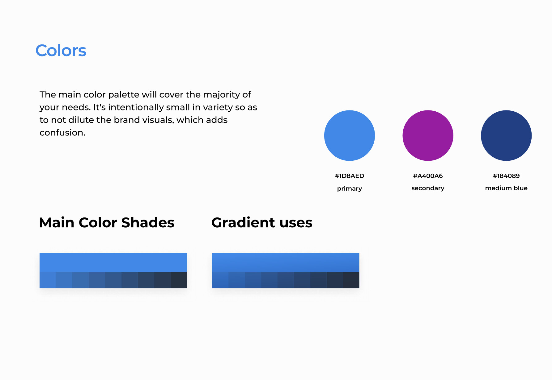
Our proposed rebrand will include a new logo, color scheme, typography, and visual style that will be consistent across all our communication channels, including the website, social media, marketing materials, and events.

We understand that a rebrand can be a significant investment, but we believe that the benefits will outweigh the costs in terms of increased brand recognition, loyalty, and engagement. We are confident that this rebrand will position us for long-term growth and success.

Thank you for considering our proposal. We look forward to your feedback and support.

Motivation

One of the most common reasons is to update an outdated or irrelevant brand, which can involve modernizing the visual identity, messaging, or tone of voice to better reflect the organization’s values, personality, or products/services. Another motivation is to differentiate from competitors in crowded or highly competitive markets by creating a unique visual identity, messaging, or product offering that sets it apart from others in the same space.

In some cases, an organization may need to rebrand to reflect a change in strategy or focus. For example, a company may shift from a product-centric approach to a customer-centric approach, and a rebrand can help communicate this change to stakeholders. Alternatively, a rebrand may be necessary to repair a damaged reputation by completely overhauling the visual identity and messaging to signal a fresh start and renewed commitment to customers.

Overall, a rebrand can help an organization stay relevant, communicate its values and goals, differentiate itself from competitors, and build a strong brand reputation that resonates with customers and stakeholders.


Dissenting Opinions

  1. Cost: Rebranding can be a significant investment, especially for larger organizations. Some stakeholders may argue that the costs outweigh the benefits, or that the resources would be better spent elsewhere.

While a rebrand can be a significant investment, it can also be a worthwhile one. A fresh, modern brand can help attract new customers, increase brand loyalty, and ultimately drive revenue. Additionally, a rebrand may be more cost-effective in the long run, as it can help avoid the need for ongoing updates and fixes to an outdated or ineffective brand.

  1. Brand equity: A brand that has already established a strong reputation and loyal customer base may not want to risk losing that equity by changing its visual identity or messaging. Some stakeholders may argue that a rebrand could confuse or alienate existing customers, and that it’s better to build on the existing brand rather than starting from scratch.

While a strong brand reputation is certainly valuable, it’s important to consider whether the current brand is still effectively communicating the organization’s values, personality, or products/services. If the current brand is outdated or no longer resonates with the target audience, a rebrand may be necessary to stay relevant and competitive. Additionally, a carefully planned and executed rebrand can build on the existing brand equity rather than eroding it.

Deliverables

• Brand book (completed)
• Brand assets zip and figma page layout for pokt.network/brandassets
• PoktDao Twitter (avatar + banner), accompanying graphics (template for New Proposal Alerts)
• PoktNews Twitter (avatar + banner), accompanying graphics (template for weekly recaps)
• Discord Banner (will rotate to new one monthly or bi-monthly to keep it fresh)
• Reddit (avatar and page)
• Event graphics for Discord events (Node Runners and Dev Log)


Copyright

Copyright and related rights waived via CC0 .

4 Likes

Wait, 150k POKT for this? Isn’t April Fool’s Day 3 weeks away?

What is a guarantee that 150k POKT investment for a new logo will attract new customers and increase brand loyalty, instead of doing exactly the opposite? This feels like created with ChatGPT basically.

no guarantees.
And yes, the proposal was created with help from chatGPT as it says.
chatGPT did not create the logo though.

Keep in mind the brand and logo will need to be changed everywhere, and Ritesh and I will help with that.

1 Like

I’m glad you’re making space to discuss our brand image and persona. Personally, I think it’s pretty boomer [derogatory] and I’d love to see us get something that inspires the same level of passion as we have in our debates. Pocket is a kick-ass project and should have a kick-ass brand. Regardless of what I say below, I would actually love to see a lot more discussion in this thread about how people see the brand and what they think we should do.

With all that said, PNF are the custodians of all Pocket Network IP. Rightly or wrongly the timing and execution of a change like this is their responsibility and this proposal is just not feasible in its current form because it hasn’t aligned the parties on a path or been scoped to include all of the time and cost included in that level of execution. I feel like this proposal is trying to litigate the pace at which we make this type of change which really doesn’t help us do what we need to do most - coordinate.

I love the design and logo and what I hard heard about narrative behind the changes, but I don’t really see how even if this proposal was approved it could be implemented by the proposers - it is wholly contingent on a bunch of other people that should also be part of the proposers list

2 Likes

To flesh out the Deliverables a little more

• Brand book (completed)
• Brand assets zip and figma page layout for pokt.network/brandassets
• PoktDao Twitter (avatar + banner), accompanying graphics (template for New Proposal Alerts)
• PoktNews Twitter (avatar + banner), accompanying graphics (template for weekly recaps)
• Discord Banner (will rotate to new one monthly or bi-monthly to keep it fresh)
• Reddit (avatar and page)
• Event graphics for Discord events (Node Runners and Dev Log)

This is just off the top of my head. I’m sure there will be many more things I think of that need to be revamped.

1 Like

Understood and thank you for chiming in.

Please tell me why you think it is so hard to corrdinate a logo change and new brand image?

1 Like

I’m not saying it’s like sending a man to the moon… but as you very much know execution is about details.

As an example, I couldn’t possibly agree more with this:

…but DNA is about to further clarify on those values and the vision, so the brand and logo should wait to make sure it reflects that too right? This is my way of saying that pushing the conversation forward is great but aligning the people and parts is more important than a vote.

4 Likes

The current logo of pokt shows two hands interacting with each other. It shows the function of pocket that builds the bridge between node runners and customers, imo. The newer logo looks like tornado and it also reminds people of Beats logo.

2 Likes

Alas I sort of like our current logo. For all the wrong reasons, I am sure (seeing that I’m dangerously close to wearing that dreaded “boomer” label).

Way, way outside anything that’s my area of expertise (or even cursory knowledge for that matter) so take anything I say with a grain of salt. A couple of reasons I like current logo - (1) the only letter I tend to see in the current logo is “p” whereas in the redesign, I see “d” simultaneous with, if not in priority to “p”. (2) the current logo makes mental connection in my mind to coinbase and chase logos, whereas with the redesign, that association is broken. That can cut both ways, I guess. In my mind, association with chase and coinbase brings subconscious trust for safety and reliability of Pocket Network, but I suppose these institutions could also stand for the epitome of centralization? Not to mention I’m sure both their logos were designed by boomers too.

I do like your font for “pokt” though… or at least for the last 3 letters. Much cleaner than the “trying too hard” of the current version. that being said, I do like the idea of carrying over design detail of the logo into the first letter of “pokt” no matter how the logo ends up looking - it cements the association between the logo and the name.

2 Likes